Writing on the Wall? How AI Is Reinventing Chinese Typography
Many assume the writing is on the wall for human typographers. For decades, the industry has been slowly decimated by the advance of digital publishing software. Now, artificial intelligence is here to finish off the job.
That view has only strengthened since the launch of OpenAI’s Image 2.0 earlier this year. Until then, type designers and typographers had clung to the hope that AI would never be able to replace them: AI-generated fonts and layouts had always looked clunky, inconsistent, error-ridden, or somehow just a bit off.
But Image 2.0’s capabilities took many by surprise: it was able to produce beautifully designed documents featuring long passages of text in multiple languages, while maintaining a high degree of accuracy. The work was not as good as that produced by professional type designers, but for a layperson looking to make a poster or a brochure, it was just fine.
Suddenly, typography — perhaps the last stronghold of graphic design still firmly controlled by professional designers — looked at risk of falling as well. If everyone can generate typefaces and layouts with a simple prompt, or even ask a frontier AI model to operate design software on its own — just as non-programmers can now “write code” through vibe coding — how many designers will lose their jobs?
In the English-speaking world, the AI revolution may indeed prove to be a hammer blow for the typography community. But things are likely to play out a little differently in China: the relationship between text and technology has always been more complex due to the nature of its writing system.
Most contemporary typographic practice derives from movable-type printing technology. Developed in medieval Germany, typography is closely tied to the inherent characteristics of the Latin alphabet: there are only a few dozen letters, and the same letters recur constantly throughout a printed text.
With these characteristics in mind, Johannes Gutenberg developed an entire technological process of carving, reproducing, retrieving, and repeatedly reusing individual letter forms. Once a complete set of letters had been produced, it could be used to print texts containing vast numbers of repetitions of exactly the same glyphs.
Gutenberg would later be credited as a pioneer of movable type printing, a technology whose logic has been carried intact from books to the screen you are now looking at. But applying this technique to Chinese characters is a huge challenge, as there is such a vast number of them. While function words such as de may appear repeatedly on a single page, most characters may occur only once or twice in a given text — or not at all.
Statistically, 3,500 characters is enough to cover most everyday text — studies have shown they account for 99.5% of character usage. But to avoid the awkward situation where a character outside the “common 3,500” can’t be rendered properly, the industry often sets 7,000 characters as the target size for a typeface. Some larger projects cover 27,000, or even 87,000 characters.
This means that Chinese typeface design has always been extremely labor-intensive. Designers have to invest huge resources in reproducing thousands of rare characters that are only used about 1% of the time. It’s one reason why Chinese printers — who actually invented movable type even earlier than Gutenberg — largely stuck with carving entire texts onto woodblocks to mass-print books for centuries. It saved producing and organizing thousands of characters that might never be used. Only gigantic projects, such as state-backed archives, would use movable-type printing.
But in the modern era, movable type-inspired workflows have come to dominate Chinese typeface design. As a result, advertisers who need to print a 20-character slogan may have to purchase the license for a typeface containing 7,000 characters. Understandably, many users are reluctant to pay type foundries, who also feel it’s an enormous burden to cover as many characters as possible.
This cost-efficiency problem is where AI can help. In fact, Chinese type foundries have been using internal AI tools to assist in typeface production for years.
Traditionally, when developing a new typeface, the lead designer will often create several hundred characters to establish the design direction, with the remaining thousands produced by a team along those lines. An AI model can also do this work with a little training: extracting patterns from those hundreds of directional characters, learning the typeface’s stylistic characteristics, and then applying them according to the structural features of different characters. The model doesn’t have to be advanced, and with human adjustment, it can deliver products with considerably increased productivity.
Since the early 2020s, open-source AI tools have also enabled independent designers to produce usable typefaces on their own. For example, designer Wang Tingrui has been using AI tools to develop typefaces reminiscent of classic lead-type printing. With the emergence of stronger models capable of generating high-quality glyph outlines, such work has become even easier.
These developments mark a new chapter for Chinese typeface design. Once a typeface’s design concept is established, whether by a lead designer or an independent practitioner, AI could be used to expand it across thousands of additional characters, making that long tail of less common characters far less of a burden.
AI may also unlock new possibilities for Chinese characters once incompatible with movable type or typefaces. The overwhelming majority of Chinese characters are created by flexibly combining different components. In theory, anyone can combine components to create a new Chinese character.
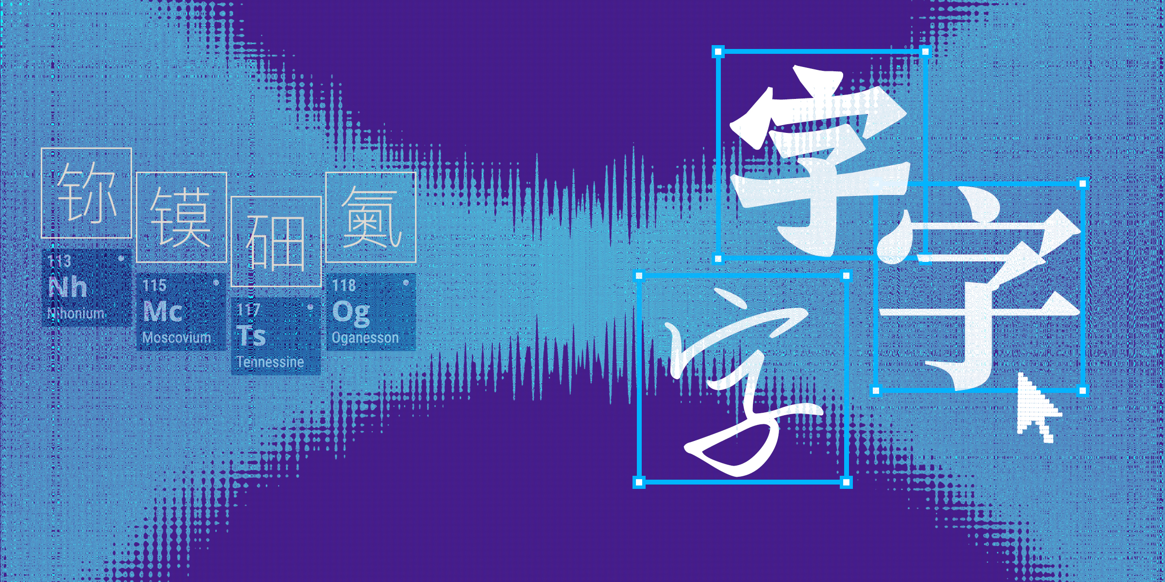
This happened in the 19th century, when Chinese chemists — tasked with translating the names of newly discovered elements into Chinese — created compound characters by combining a semantic component indicating the element type and a phonetic component based on the initial sound of its Western name. This system continues to this day, when scientists occasionally need to name new synthetic elements.
While inventing a new character is relatively simple, it used to be difficult to introduce them into everyday language because of the inherent barriers created by digital typefaces. Traditional typeface design is built around recording whole characters, not their components, so any new character would not appear in previously existing typefaces.
With AI, however, that could all change. The technology should allow users to render new characters in the style of an existing typeface, making it easier for them to gain traction.
Beyond this, AI is ushering in a fundamental shift in the nature of typography. While the modern typeface system uses the single character or letter as its basic unit, this is just one way to recreate text. In woodblock printing, for example, Chinese printers produced entire pages all at once.
Today’s leading AI models — including Qwen, Seedream, ChatGPT, and DALL-E — are moving towards a system that bypasses typefaces entirely. Text is generated directly onto posters, videos, and the cover images for posts on China’s version of TikTok, Douyin, in a particular visual style, according to a user’s preferences. Users specify the style they want using a prompt — or a handwritten demonstration — and the AI model simply creates a font, rather than using a commercial one.
This approach still has problems. One issue often raised is the inconsistency of AI-crafted characters, but this should be solvable as models become more advanced. There is also a debate over copyright, especially when generated text resembles existing typefaces. Yet these issues are unlikely to stop ordinary users from using AI to speed up their design work.
It is easy to imagine a not-so-distant future in which everyone can generate high-quality typefaces and typography through instructions, whether they are designing for an illustration, an advertisement, a poster, or even an entire book. For type foundries, AI is likely to be incorporated into their workflows, just like what has been happening in the “hybrid” mode of production in the film industry.
Then, what is left for professional type designers to do?
One thing is clear: they will no longer monopolize the creation of stylistic Chinese characters. Similar upheavals have happened in the past, when typewriters, computers, and smartphones granted more people the power to produce texts.
But professionals have a more important job: pushing the boundaries of design. In a world where the production of text becomes effortless and inexhaustible, designers’ role as the gatekeepers of taste and judgment only becomes more prominent.
We should keep experimenting to deliver high-quality work with novel and sophisticated aesthetics. The decades of training we have received won’t be wasted. Rather, it will continue to shape a philosophy that pioneers future designs, regardless of what technology is involved.
(Header image: Fu Xiaofan/Sixth Tone)