The ‘Archeologists’ Unearthing China’s Pre-Digital Fonts
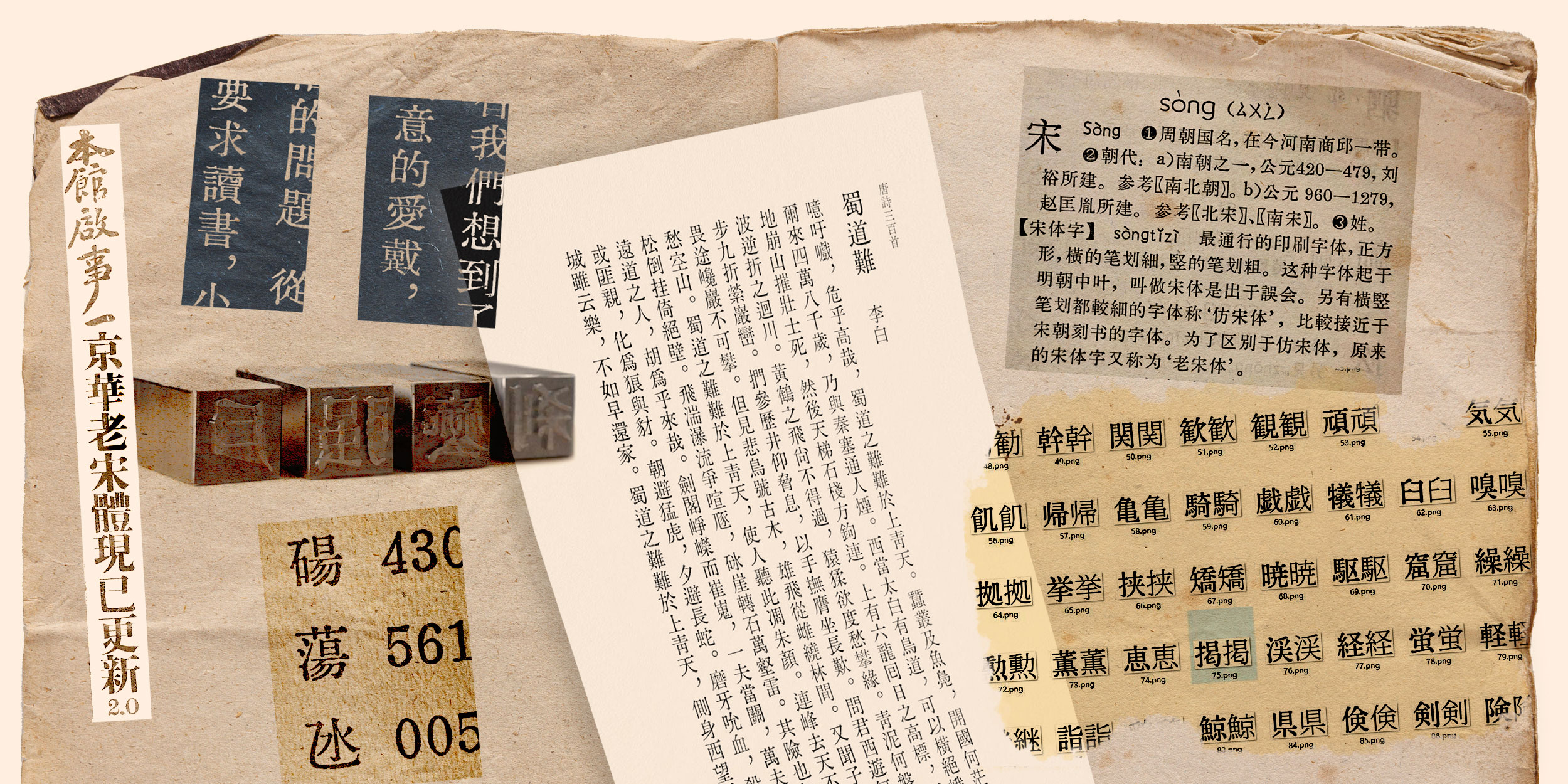
Wang Tingrui spends much of his free time searching online bookstores for dictionaries, novels, and other publications from the last century. He carefully looks at the product photos, zooming in on the Chinese characters to examine their structure and strokes. He’s on the hunt for a specific font: the 61-1 Songti movable type, developed in 1961 by Beijing Xinhua Type Matrix Factory.
Any book that uses the font is, to Wang, a gold mine. He’ll purchase it so he can scan its pages and then “cut out” individual characters. This way, he is making a digital recreation, which he calls “Kinghwa Old Songti” — the name he picked in tribute to the type’s original manufacturer, using, to emphasize his bid for nostalgia, an old way to transliterate jinghua.
This and other classic fonts Wang, 30, has carefully reconstructed over the years are labors of love that he releases online for free (under his English name, Terry Wang). He is part of Hanzi Type Archaeo, a loose online community of self-defined “archeologists” trying to keep these symbols of early Chinese modernity alive.
They focus on fonts, like 61-1 Songti, that were created using movable types made from metal, typically lead. This technology, whereby small reusable pieces for every letter or character are arranged to form a text, was used before book publishing went digital.
Wang and many other young typeface enthusiasts grew up reading on screens or from modern books, both of which have flawless fonts but are also somewhat lacking in personality. In contrast, the older movable type fonts, while showing traces of industrial production and standardization, have subtle idiosyncrasies, such as the characters’ uneven edges that come as a result of being printed on cheap, rough paper.
Before the introduction of movable type, printing in China was done via woodblock carving, which involved carving a unique wooden block for every page. It gained widespread adoption during the late Tang dynasty, which ended in the year 907.
During the subsequent Song dynasty, movable type printing was invented using molded clay pieces, but did not catch on: the Chinese script’s library of tens of thousands of unique characters was too big a barrier for the invention to overcome.
When, in the 15th century, German inventor Johannes Gutenberg invented movable type printing using lead, he revolutionized publishing for languages that use alphabets. It proved much faster than copying books by hand.
But it wouldn’t be until the early 19th century that the technique would start making its way to East Asia. European printing houses began studying how to print Chinese characters with metal movable type for the purpose of printing translations of the Bible.
They opted for the well-established printing style Songti. Its straight, thin lines were easy to master and consistent with the appearance of serif Latin fonts. However, due to Europeans’ unfamiliarity with the language, their Chinese movable type pieces were poorly executed.
Western missionaries in Asia, who better understood the language and its characters, made important contributions to the development of Chinese metal movable type. For example, their discovery that only around 3,000 characters are needed to reproduce a book about a given subject — say, a religious text like the Bible — improved production efficiency. They also established a system for adjusting the size of Chinese movable type so it became possible to use them together with movable type Latin letters.
William Gamble, an Irish American Presbyterian missionary, found a way to improve the accuracy of the pieces. He introduced an electrochemical method for turning the wood-carved characters made by Chinese artisans into metal molds, thereby striking a balance between aesthetics and convenience.
At the end of the 19th century, lead movable type finally swept East Asia’s printing industry. Some Chinese workers who had apprenticed in local but foreign-owned printing houses later set up their own businesses and produced new lead movable types with fonts that resembled handwritten characters.
Meanwhile, Japanese workshops used Gamble’s designs and techniques to develop a bold, sans-serif-like typeface known in China as Heiti. Over the 20th century, Heiti and Songti gradually became the most used typefaces across the Sinosphere, and remain so today.
The advent of the digital age led the publishing industry to gradually phase out lead movable type. Ever since the telegram era, how to efficiently translate the thousands of Chinese characters into simple code had proven challenging. But once that problem was solved, a system using lasers, and later the widespread adoption of personal computers and smartphones, made lead movable type obsolete.
And yet, lead type has not vanished from collective memory. Some designers have refashioned old lead type pieces into pendants, seals, and other ornaments. Some small stores offer customers the chance to print their own messages on paper using old lead movable type, while apps like Xiaohongshu, known as RedNote in the West, and CapCut allow creators to add text such as video subtitles in the style.
For professional designers, the lead movable type styles offer advantages. Its characters bring a retro touch while remaining uniform in size and structure — and thus easier to use — compared with fonts based on woodblock printing.
To answer such demand, commercial companies have begun digitizing lead movable types. However, despite their greater resources and better technology than amateur archeologists like Wang, their products are not always successful. With their smoothed contours and other touch-ups, they are considered inauthentic by enthusiasts. Regular readers aren’t sophisticated enough to notice the differences with modern fonts.
Wang, meanwhile, is continuing his work. The first version of Kinghwa Old Songti contained over 36,000 characters, but he has only managed to find around 5,700 in secondhand books. For the rest, he used an AI model to apply the style of his scanned files onto the missing characters. To replace these AI characters with real lead movable type versions, he continues to scour the web for more books.
Translator: David Ball.
(Header image: Visuals from @活字攷古 on WeChat and VCG, reedited by Sixth Tone)